The Brand Refresh.
I didn’t touch the main Gatorade logo. Instead, we gave FIT its own voice—one rooted in wellness, backed by science, and fueled by modern design. This was a shift from “elite athlete” to “everyday hydration,” without losing Gatorade’s signature energy.


Modern, not modified.
Rather than redesigning the iconic Gatorade bolt, I refined its role within the FIT identity—scaling it back and letting wellness lead. This subtle shift helps distinguish FIT while preserving the brand equity of Gatorade’s most recognizable symbol.
The Icon Refresh.


From Performance to Wellness: A Bold New Era for Gatorade FIT
Gatorade FIT was built for wellness—but its story wasn’t being told. Our challenge was to reposition this overlooked sub-brand and reconnect it with a new generation of consumers—without losing the core energy of Gatorade.
I developed a refreshed identity and communication strategy for Gatorade FIT—designed to compete in a wellness-first market where visual clarity, authenticity, and function reign.
My Role.
Brand Strategist + Designer
This was a solo project where I led end-to-end creative strategy—from market analysis and sub-brand positioning to visual refresh and execution across packaging, website, and influencer activations. I also integrated over 100+ AI-generated ideation prompts into my creative process to test messaging, visuals, and tone across multiple consumer personas.


What’s the problem?
Gatorade FIT was created to compete in the wellness space—but consumers didn’t see it that way. Visually, it blended into the performance-first Gatorade lineup. Strategically, it lacked a clear identity.
While competitors like Liquid I.V. and Prime were bold, benefit-driven, and clean, Gatorade FIT felt caught between two worlds—and it was losing ground fast.
Wellness tops performance as the new standard
Gen Z and Gen Alpha crave clarity, customization, and connection.
Gatorade’s performance heritage felt disconnected from everyday health.
“Healthy” sub-brands weren’t clearly segmented or positioned.
Prime gained 8.2% market share in one year—by doing what Gatorade didn’t.


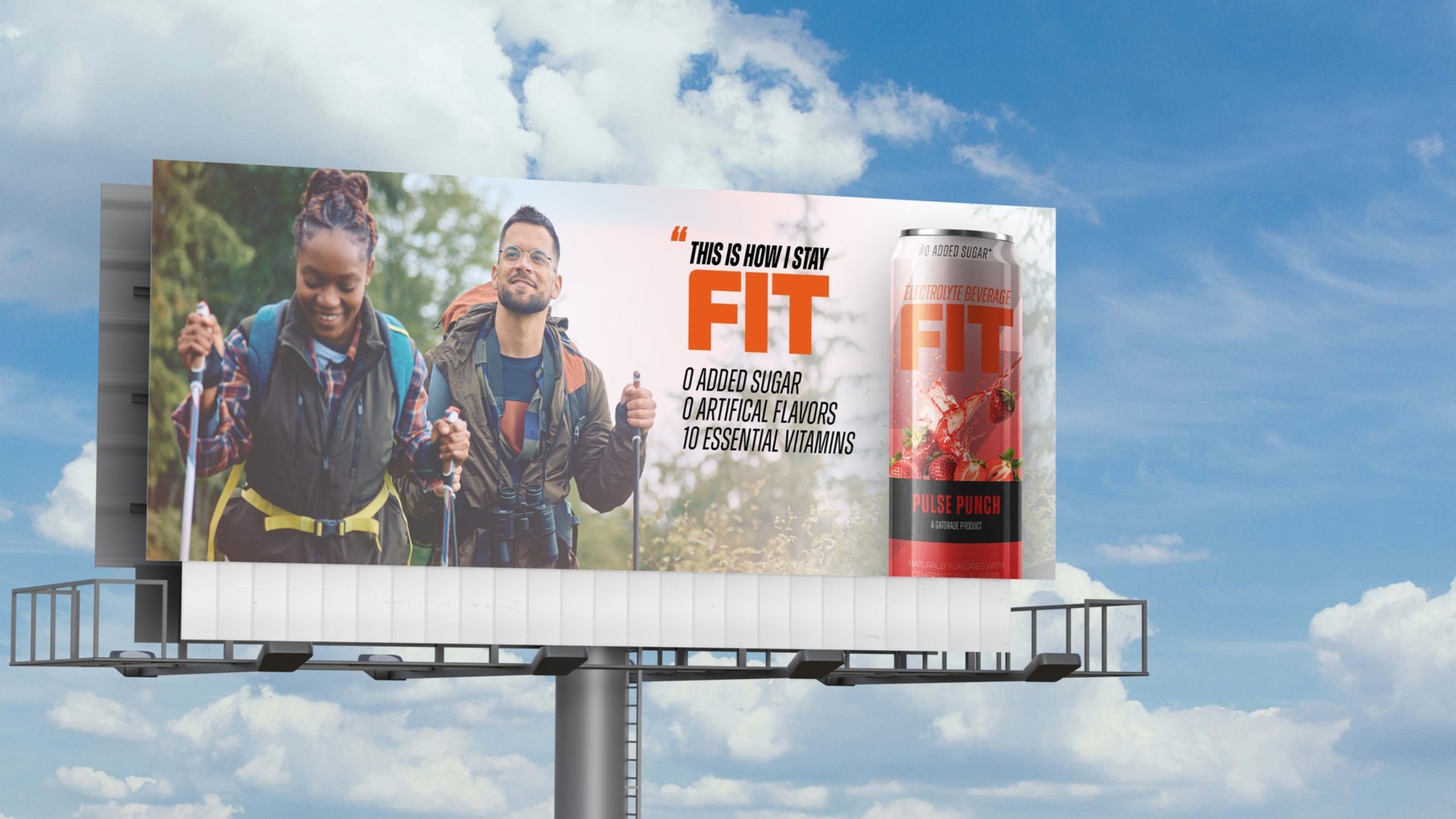
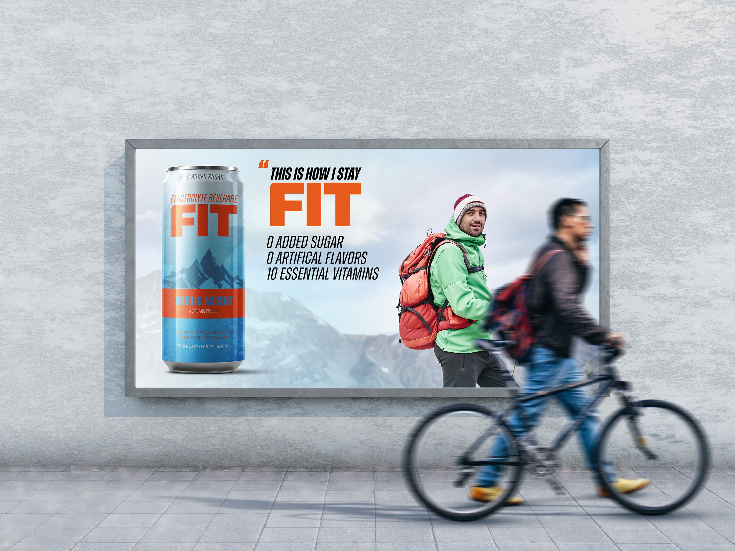
OHH Advertising
FIT’s out-of-home campaign shows up where movement matters—city streets, transit hubs, and gyms. Clean visuals and bold taglines like “0 Crash. All Climb.” make the product message instantly clear.
Designed for quick impact, each placement uses strong contrast and confident typography to stop people in their tracks. The result? Wellness that looks sharp, feels personal and sticks with you—long after the billboard.

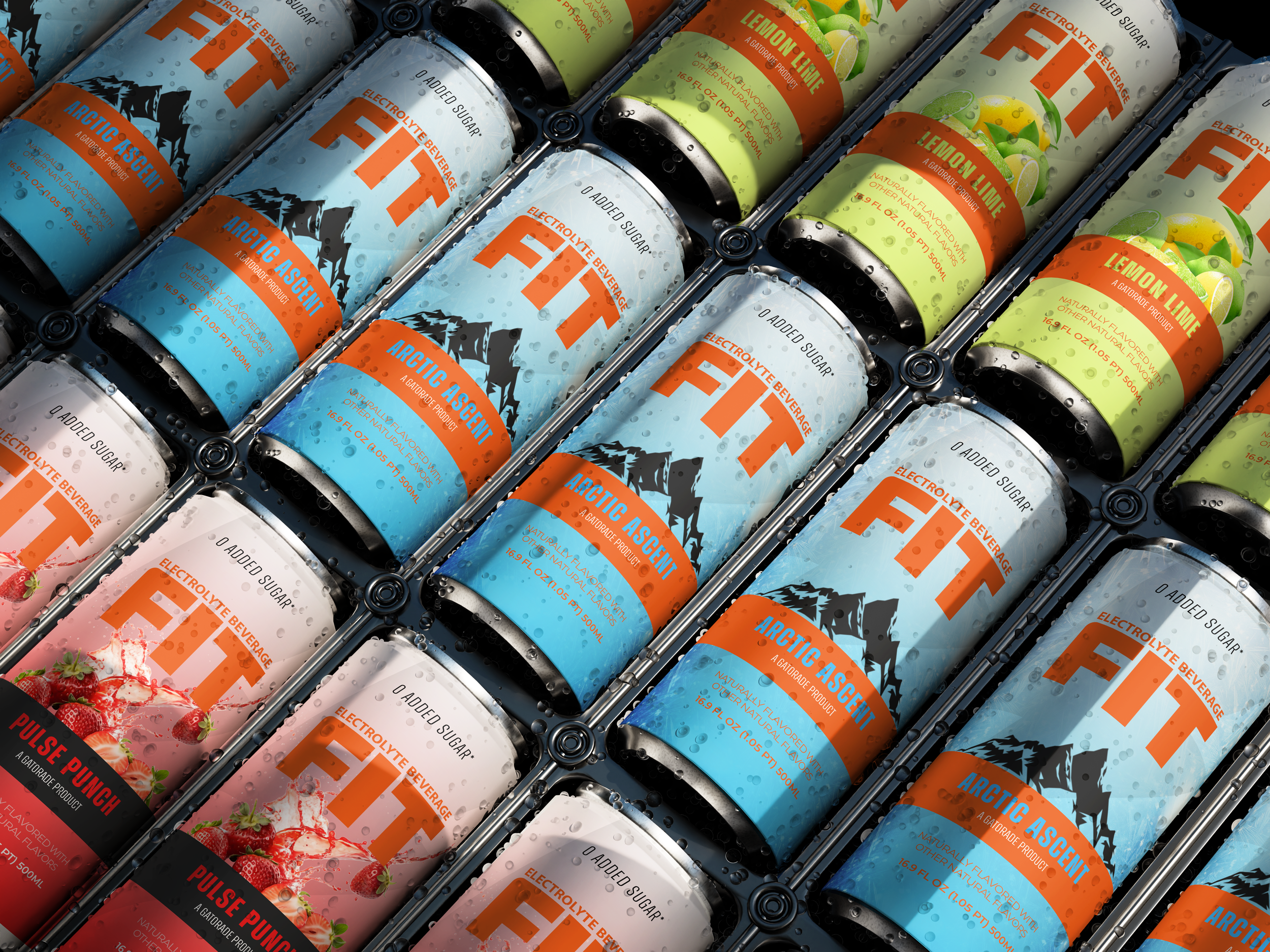
Packaging Refresh.
The new FIT packaging features a simplified layout, wellness-first messaging, and bold modern colors that reflect hydration, clarity, and health. It creates clear separation from other Gatorade products while standing tall on wellness-first shelves.


Website Redesign
A Bold First Impression
The homepage opens with a bold brand promise: “Artic Ascent for Every Climb.” This line sets the tone for a product that delivers performance hydration without the crash. The visual layout is clean, with intentional whitespace and strong color blocking to frame the can. A rotating hero image and clear benefit messaging—“0 added sugar. 0 crash.”—cut straight to the product’s value.
This section quickly establishes FIT’s position in the market: science-backed, visually strong, and unapologetically functional.
Everyday Hydration, Redefined
The next scroll dives deeper into what FIT offers. Short, punchy descriptors like “Electrolyte Beverage” and “Real flavor. Real fuel.” align with Gen Z’s preference for quick, benefit-first copy. The tone is clean and confident, with messaging that leans into performance and lifestyle.
Here, visitors begin to see that FIT is not just for pro athletes—it’s for climbers, commuters, and anyone who wants hydration without compromise.
Stories That Move
Testimonials from real athletes—including a pro triathlete and an Olympic track star—add authenticity and trust. Alex Honnold, a professional climber and environmentalist, is featured front and center with a callout that ties back to FIT’s core proposition: clarity, hydration, and focus.
Visual storytelling shines here. The image grid—ranging from high-altitude climbs to family moments—positions FIT as more than just a drink. It’s a companion for every version of wellness.
Data with Purpose
The “By the Numbers” section reframes success through facts and figures. Whether it’s 890K+ bottles sold or 167K+ active users, these stats serve as evidence of FIT’s traction and impact. This section also reminds users that FIT isn’t just a niche product—it’s part of a larger movement toward cleaner, smarter hydration.
Visually, the stats break up the page and give users a breather before the final CTA.
The Final Pitch
Everything leads to the final product spotlight—a clean, centered image of the can with a strong visual payoff. The mountainscape backdrop ties to the “Artic Ascent” flavor and reinforces the adventurous, performance-meets-nature vibe. The price ($4.99) and a clear “Buy Now” button offer a strong finish with conversion in mind.
The journey ends as intentionally as it begins—inviting users to elevate their beverage experience with clarity, confidence, and just enough grit.
